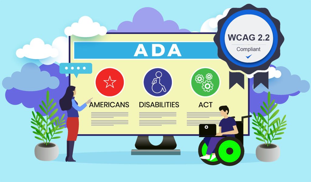
The World Wide Web Consortium (aka: W3C) is the heavyweight setting the bar for web design that businesses worldwide must follow. They also laid out the Web Content Accessibility Guidelines (WCAG). Their mission? To make sure that website content is accessible to folks with disabilities and unique needs.
The WCAG guidelines are organized under four main principles, which assert that to be accessible, all web content must be:
Perceivable: Users should be able to perceive information and user interface components in a manner that is accessible to them. This implies that the information being presented must be detectable by the users through their senses and should not be invisible.
Operable: User interface navigation and components should be designed to be easily operable. This implies that users should be able to interact with the interface without facing any tasks or actions that are beyond their capabilities.
Understandable: Information and the functioning of the user interface should be easily understandable. This implies that users should be able to comprehend both the presented information and the operation of the user interface, without encountering content or processes that are beyond their level of understanding.
Robust: Content should be robust to ensure reliable interpretation by different user agents, including assistive technologies. This implies that users should be able to consistently access the content as technology progresses, ensuring ongoing accessibility even as user agents and technologies evolve.
These principles are designed to accommodate a wide range of conditions and disabilities, including visual, auditory, physical, speech, cognitive, language, learning, and neurological disabilities.
WCAG has been the gold standard for digital accessibility worldwide for nearly two decades. They don’t play favorites when it comes to technology or industry.

WCAG 2.2 Draft
There is always room for improvement, which leads us to WCAG 2.2, the new WCAG standard that may be released later this year.
The WCAG standard gets updated for several key reasons:
Technological Advancements: As technology evolves, new challenges and possibilities for accessibility emerge. The WCAG needs to be updated to reflect these changes and to provide guidance on how to make the latest technologies accessible. For example, the rise of mobile browsing, touch interfaces, voice recognition, and virtual or augmented reality have all required updates to accessibility guidelines.
Improved Understanding: Our understanding of accessibility and disability also evolves over time. As we learn more about the diverse ways that people interact with technology, we can create more effective guidelines. This includes recognizing and addressing new types of barriers, as well as understanding that accessibility benefits all users, not just those with disabilities.
Feedback and Experience: The WCAG is a living document. After it’s published, people use the guidelines to make their websites more accessible and often find areas that are unclear, missing, or could be improved. This feedback from the community leads to updates and improvements.
Legal and Policy Changes: As laws and policies around the world evolve, the WCAG may need to be updated to align with these changes. This can include new requirements for accessibility, as well as the need for guidelines that can be more easily translated into different languages and cultural contexts.
Each new version aims to be backward compatible, meaning it includes and extends the guidance from previous versions, so that even as the web moves forward, we don’t leave behind those who rely on older technologies or techniques.
While it hasn’t been released officially, we do have access to the WCAG 2.2 Draft with proposed changes such as:
Guideline 2.4.11 Focus Not Obscured (Minimum AA): This guideline ensures that when a user interface component receives keyboard focus, the component is not entirely hidden due to author-created content.
Example: Imagine a website where a pop-up banner appears at the bottom of the screen. If a user is navigating with a keyboard and the focus moves to a button that is behind this banner, the button should not be hidden by the banner. The user should be able to see what has focus at all times.
Guideline 2.5.7 Dragging Movements (AA): This guideline emphasizes that any functionality relying on dragging movements should also offer an alternative method of operation using a single pointer, unless dragging is crucial to the functionality or dictated by the user agent without author modification.
Example: Consider a website feature that allows users to move items in a list by clicking and dragging them. To meet this guideline, the website should also offer an alternative way to move items that doesn’t require dragging, such as using up and down arrows to reorder items.
Guideline 2.5.8 Target Size (Minimum AA): This guideline represents that the target size for pointer inputs is a minimum of 24 by 24 CSS pixels, with specific exceptions in certain conditions.
Example: On a webpage, buttons, and other clickable elements should be large enough to easily click or tap. Specifically, they should be at least 24 by 24 CSS pixels in size. For example, small buttons close together could cause a user to accidentally click the wrong one, so providing adequately sized targets can prevent this.
Guideline 3.2.6 Consistent Help (A): This guideline mandates that if a web page incorporates help mechanisms that are duplicated across multiple pages within a set, they must maintain a consistent relative order with other page content, unless a user-initiated change occurs.
Example: If a website offers a help feature, like a chat box or a help menu, this feature should appear in the same place on every page. For instance, if the chat box is in the lower right corner on one page, it should be in the lower right corner on all other pages too.
Guideline 3.3.7 Redundant Entry (A): This guideline asserts that any information inputted or provided by the user in a given process, which needs to be re-entered, should either be automatically populated or made readily available for selection by the user, with specific exceptions in certain conditions.
Example: If a user has to fill out a form on a website, and then another similar form later in the same process, the website should automatically fill in the second form with the information from the first. This prevents the user from having to enter the same information twice.
Guideline 3.3.8 Accessible Authentication (Minimum AA): This guideline requires that a cognitive function test, such as remembering a password or solving a puzzle, is not required for any step in an authentication process unless that step provides at least one of the specified alternatives.
Example: If a website requires users to log in, it should offer an alternative to remembering and typing in a password. For example, the site could send an email with a login link, so the user can access their account without having to remember their password.
Our team would like to stress that these may not be in the final document, but it is good to know what is coming down the pike. ADA website compliance is one of our specialties; we work with all sizes of businesses (from small service sites, e-commerce, to Fortune 500 companies). We offer Website Audits and Updates, Custom Web Design, ADA Monitoring, and for folks with in-house teams, we offer ADA Compliance Training.


